🎨 Web Design Principles for Non-Designers: A Practical Guide
🎨 Web Design Principles for Non-Designers: A Practical Guide
You don’t need a degree in graphic design to create a website that looks professional, builds trust, and effectively converts visitors into customers. In fact, some of the most effective websites are built on a foundation of simple, timeless design principles. Good design isn’t about flashy animations or complex artistry; it’s about clear communication. By understanding a few core principles, any business owner can make design choices that lead to a more polished and effective online presence.
This guide will break down the essential design rules that every non-designer should know. Whether you are customizing a template on a website builder or sketching out ideas for a digital agency, these fundamentals will help you create a website that not only looks great but also works beautifully.
💡 Why Good Design is Good for Business
- First Impressions are Instant: Studies show that it takes users about 50 milliseconds to form an opinion about your website, and that opinion determines whether they stay or leave.
- It Builds Trust: A professional, well-organized design signals that your business is credible and trustworthy. A sloppy, confusing design does the opposite.
- It Improves Usability: Good design guides users where you want them to go, making it easier for them to find information and complete actions, like making a purchase.
- It Strengthens Your Brand: A consistent visual style reinforces your brand identity and makes your business more memorable.
✨ The 5 Core Principles of User-Friendly Design
Mastering these five principles will have the biggest impact on the quality of your website design.
1. Hierarchy: Guiding the User’s Eye
Visual hierarchy is the arrangement of elements to show their order of importance. Your most important message should be the most prominent thing on the page. You can create hierarchy using:
- Size: Larger elements grab more attention. Your main headline (H1) should be the largest text on the page.
- Color: Bright, bold colors stand out more than muted, neutral tones. Use your brightest color for your most important call-to-action buttons.
- Placement: Elements placed at the top of the page or in the center are perceived as more important.
2. Contrast: Making Key Elements Stand Out
Contrast is what makes your content readable and scannable. It’s about making elements different so they are easy to distinguish. Ensure you have strong contrast between:
- Text and Background: Dark text on a light background is the most readable combination.
- Font Types: Pairing a serif headline with a sans-serif body font can create a pleasing contrast.
3. Repetition and Consistency: Building Trust
Consistency in your design creates a sense of cohesion and makes your site easier to use. Repeat certain elements throughout your site:
- Colors: Use the same color palette on every page.
- Fonts: Use the same one or two fonts for all your headings and body text.
- Layout: Keep your navigation menu, logo, and footer in the same place on every page.
4. Proximity: Grouping Related Elements
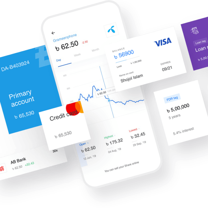
Items that are related to each other should be placed close together. This creates a visual relationship between them and reduces clutter. For example, an image should be placed close to its caption, and a call-to-action button should be placed right next to the text that describes the offer.
5. White Space: The Art of Breathing Room
White space (or negative space) is the empty space around the elements on your page. It is one of the most important and overlooked design principles. Proper use of white space:
- Improves Readability: It gives your text room to breathe, making it easier to read.
- Creates Focus: It can be used to draw attention to your most important elements, like a CTA button.
- Conveys Elegance and Professionalism: A clean, uncluttered design feels more sophisticated.
🛠️ A Practical Toolkit for Non-Designers
- Use a Website Builder with Great Templates: Start with a professionally designed template. The core principles are already built-in for you.
- Find a Color Palette: Use a tool like Coolors.co to generate a professional color palette. Stick to 2-3 main colors.
- Choose Your Fonts: Use Google Fonts to find two fonts that work well together—one for headings and one for body text.
- Use High-Quality Images: Use free stock photo sites like Unsplash or Pexels for professional images.
✅ Putting It All Together: A Homepage Example
Imagine a simple homepage layout applying these principles:
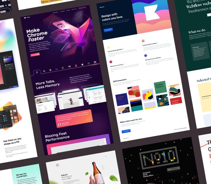
- Hero Section (Hierarchy & Contrast): A large, bold headline with a clear value proposition, placed over a high-quality background image. A bright, contrasting call-to-action button is placed right below it.
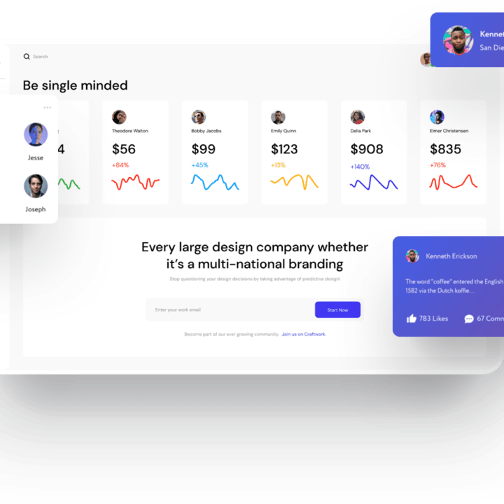
- Services Section (Proximity & Repetition): Three service offerings are displayed in a row, each with an icon, a short heading, and a brief description. The layout for each of the three services is identical (repetition).
- Testimonial Section (White Space): A single, powerful customer quote is featured with plenty of white space around it to make it stand out.
🏆 Case Studies: The Impact of Good Design
Case Study 1: A Nonprofit Organization
A local nonprofit had a cluttered website with too many colors and inconsistent fonts. It was hard to find the “Donate” button. They redesigned their site using a simple color palette, consistent typography, and a prominent, contrasting “Donate” button in the header. Online donations increased by 22% in the first three months.
Case Study 2: A Local Retail Store
A boutique store built their website using a Pixel Cloud Media template. They focused on using high-quality product photos and maintaining plenty of white space to create a clean, high-end feel. Their average time on site increased by 40% because the site was more pleasant and easier to browse.
❓ Frequently Asked Questions
Can a beginner’s website really look professional?
Yes, absolutely. By focusing on the core principles of simplicity, consistency, and white space, and by starting with a professional template, a non-designer can create a site that looks just as good as one built by an agency.
What is the easiest way to ensure my design is good?
Start with a high-quality template from a modern website builder. These templates are created by professional designers and have the core principles already baked in. Your job is simply to customize it with your own content without breaking the underlying structure.
Should I copy my competitor’s design?
You can look to your competitors for inspiration, but you should never copy them directly. Your website design is a key part of your brand identity, and it should be unique to your business.
Professional design is accessible to everyone. By following the fundamental principles of hierarchy, contrast, consistency, proximity, and white space, any business owner can create a website that looks credible, engages visitors, and drives results. Ready to make your brand shine online? Start with Pixel Cloud Media’s Website Builder and unlock design tools made for non-designers, or consult our agency team for advanced design and branding.


