


🎨 Color Theory for Business Websites: Psychology and Practical Application
🎨 Color Theory for Business Websites: Psychology and Practical Application
Color is one of the most powerful, non-verbal forms of communication. The colors you choose for your website do more than just make it look good; they evoke emotions, convey meaning, and can significantly influence your visitors’ perceptions and actions. In fact, studies show that up to 90% of snap judgments made about products can be based on color alone. For a business owner, understanding the basics of color theory is essential for creating a website that is not only visually appealing but also psychologically effective.
This guide will break down the fundamentals of color theory, the psychology behind different colors, and how you can practically apply this knowledge to your website. Whether you are choosing a color scheme for a new brand or refining an existing site on a website builder, these principles will help you make choices that strengthen your brand and drive results.
🤔 What is Color Theory? A Quick Primer
Color theory is a set of principles used to create harmonious color combinations. It provides a logical structure for color, covering concepts like the color wheel, color harmony, and the visual effects of specific color combinations. Understanding these basics is the first step to using color effectively.
🧠 The Psychology of Color: What Your Colors are Saying
Different colors evoke different emotions and associations. Here’s a breakdown of what common colors mean in Western cultures:
- Red: Evokes feelings of energy, passion, excitement, and urgency. It’s often used for clearance sales and call-to-action buttons to create a sense of urgency. (e.g., Coca-Cola, Netflix).
- Blue: Conveys trust, security, stability, and professionalism. It’s a favorite among financial institutions, tech companies, and healthcare providers. (e.g., Chase Bank, IBM, Facebook).
- Green: Associated with nature, health, growth, and wealth. It’s a popular choice for environmental brands, health and wellness products, and financial services. (e.g., Whole Foods, Starbucks).
- Yellow: Represents optimism, happiness, and warmth. It’s great for grabbing attention but can be fatiguing to the eye in large doses. (e.g., McDonald’s, IKEA).
- Orange: A blend of red’s energy and yellow’s cheerfulness. It’s seen as creative, enthusiastic, and friendly. (e.g., The Home Depot, Nickelodeon).
- Purple: Often associated with luxury, royalty, wisdom, and creativity. It’s used by premium and imaginative brands. (e.g., Cadbury, Hallmark).
- Black: Signifies power, elegance, and sophistication. It’s a staple for luxury brands and high-end fashion. (e.g., Chanel, Nike).
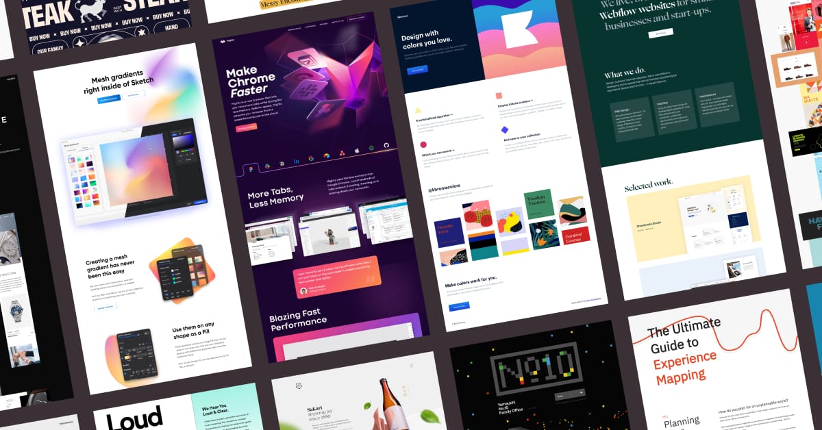
🎨 Building Your Brand’s Color Palette: A Step-by-Step Guide
A good color palette typically consists of 3-4 colors.
- Choose Your Primary Color: This should be the color that best represents your brand’s personality and values. It will be the most dominant color in your design.
- Choose Your Secondary Color(s): These colors should complement your primary color. You can use a color wheel to find harmonious combinations (like analogous or complementary colors).
- Choose a Neutral/Background Color: This will be the color for your backgrounds and text. White, off-white, or a light grey are safe and effective choices that improve readability.
✅ Applying Your Color Palette to Your Website
A common and effective strategy for applying your color palette is the 60-30-10 rule:
- 60% should be your dominant/primary color. This will often be your neutral background color, setting the overall tone.
- 30% should be your secondary color. This is used to create contrast for things like subheadings, secondary buttons, or highlighted sections.
- 10% should be your accent color. This should be your brightest, most eye-catching color, reserved for your most important elements, like your main call-to-action buttons.
👁️ The Importance of Color Accessibility
Not everyone sees color in the same way. To ensure your website is accessible to users with color vision deficiencies, you must ensure there is sufficient contrast between your text and its background. The Web Content Accessibility Guidelines (WCAG) recommend a contrast ratio of at least 4.5:1 for normal text. You can use a free online tool to check your color combinations.
🛠️ Tools for Choosing and Testing Colors
- Coolors.co: A fast and easy tool for generating beautiful color palettes.
- Adobe Color: A more advanced tool that lets you create palettes based on color harmonies.
- WebAIM Contrast Checker: An essential tool for checking if your text and background colors meet accessibility standards.
🏆 Case Studies: The Impact of Color
Case Study 1: An E-commerce Store
An online store was using a muted, grey call-to-action button. They A/B tested it against a bright, contrasting orange button. The orange button resulted in a 17% increase in clicks and a significant lift in sales, simply because it was more noticeable.
Case Study 2: A Local Dental Practice
A dental clinic’s website used a jarring combination of red and yellow, which can evoke feelings of anxiety. They redesigned their site using a calming palette of blue and white to reinforce a sense of trust and professionalism. Their bounce rate dropped by 30% as new patients felt more reassured by the site’s design.
❓ Frequently Asked Questions
How many colors should I use on my website?
It’s best to stick to a simple palette of 2-3 main colors, plus a neutral color for backgrounds. Using too many colors can make your site look cluttered and unprofessional.
Should I use trendy colors?
While it can be tempting to use trendy colors, it’s more important to choose colors that align with your brand’s personality and will stand the test of time. A classic, well-chosen palette is always a safe bet.
Can my website builder help me with colors?
Yes, most modern website builders come with pre-designed templates that have professional color palettes already built-in. They also allow you to easily set your own brand colors that will be applied consistently across your site.
Color is a powerful tool in your design toolkit. By understanding the psychology of color and applying the principles of color theory, you can create a website that not only looks great but also communicates your brand message effectively and guides your users toward conversion. Ready to give your site a professional look? Use Pixel Cloud Media’s Website Builder with built-in color controls, or consult our design agency to build a brand-perfect website that performs.