


📱 Mobile-First Design: Why Small Screens Should Drive Your Design
📱 Mobile-First Design: Why Small Screens Should Drive Your Design
For years, websites were designed for large desktop monitors and then adapted to smaller screens as an afterthought. That era is over. In 2025, with over 70% of global web traffic coming from smartphones, mobile is no longer a secondary consideration—it is the primary context in which most of your customers will experience your brand. This reality has given rise to the mobile-first design philosophy, a strategy that is now essential for any business that wants to succeed online.
If your website isn’t designed with mobile users in mind, you are not just creating a poor user experience; you are actively harming your SEO rankings and losing potential sales. This guide will explain what mobile-first design is, why it’s non-negotiable, and how you can implement its principles, whether you are using a website builder or embarking on a custom design project.
🤔 What is Mobile-First Design?
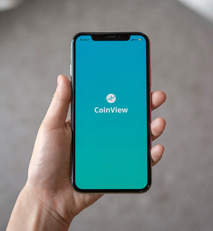
Mobile-first design is a design strategy that involves starting the design process with the smallest screen (mobile) and then scaling the design up for larger screens like tablets and desktops. This approach forces you to prioritize the most essential content and functionality from the very beginning, as you have limited space to work with. It’s a content-first, user-focused methodology.
🔄 Mobile-First vs. Responsive Design: What’s the Difference?
These two terms are closely related but distinct:
- Responsive Design is the *technical implementation*. It means your website’s layout uses flexible grids and media queries to adapt to any screen size.
- Mobile-First is the *design strategy*. It dictates the order in which you design. Instead of designing for the desktop and then trying to shrink it down (which often leads to a cluttered mobile experience), you design for mobile first and then progressively enhance the design for larger screens.
All mobile-first sites are responsive, but not all responsive sites are mobile-first. A mobile-first approach leads to a better, more focused responsive design.
🚀 Why a Mobile-First Approach is Non-Negotiable
- The Majority of Your Users are on Mobile: For most businesses, more than half of your website traffic is coming from smartphones. Catering to the majority is just good business.
- Google’s Mobile-First Indexing: Since 2019, Google primarily uses the mobile version of a website for indexing and ranking. If your mobile site is a poor experience, your SEO will suffer across the board.
- Improved User Experience: A mobile-first approach forces you to be disciplined and focus on what really matters. This leads to a cleaner, faster, and more user-friendly experience on all devices.
✅ The Core Principles of Mobile-First Design
- Content Prioritization: On a small screen, you must decide what content is absolutely essential and place it at the top. Less important content can be placed further down or on secondary pages.
- Simplified Navigation: Complex, multi-level desktop menus don’t work on mobile. Use a simple, clear navigation system, like a hamburger menu, with a limited number of options.
- Touch-Friendly Design: Buttons and links must be large enough to be easily tapped with a finger. Ensure there is enough space between clickable elements to prevent accidental taps.
- Readable Typography: Use a clean, legible font and ensure your body text is at least 16px.
- Performance Optimization: Mobile users are often on slower connections. Your site must be lightweight and fast. This means optimizing images and minimizing code.
📈 The Impact of Mobile-First on SEO and Conversions
Adopting a mobile-first strategy has a direct and positive impact on your key business metrics:
- Higher SEO Rankings: A fast, mobile-friendly site is favored by Google’s algorithm.
- Lower Bounce Rates: A good mobile experience keeps users on your site longer.
- Increased Conversions: A simple, frictionless mobile checkout process leads to more sales.
⚠️ Common Mobile Design Mistakes to Avoid
- Intrusive Pop-ups: Large pop-ups that cover the main content are especially frustrating on a small screen and can lead to Google penalties.
- Tiny, Hard-to-Tap Buttons: If users have to zoom in to click a button, your design has failed.
- Hiding Important Content: Don’t hide key information behind too many taps or in a complex menu.
- Slow Load Times: Large, unoptimized images are the number one cause of slow mobile sites.
🏆 Case Studies: The Power of Mobile-First
Case Study 1: A Local Retailer
A local retailer redesigned their cluttered, desktop-focused website with a mobile-first approach. They simplified their navigation, prioritized their store hours and location, and made their “Shop Online” button much more prominent on mobile. Their mobile conversion rate increased by 40%, and their average session duration on mobile doubled.
Case Study 2: An E-commerce Store
An online store was seeing a high cart abandonment rate on mobile. They realized their multi-step checkout process was too cumbersome on a small screen. They implemented a simplified, single-page checkout for mobile users. This change alone led to a 22% lift in completed sales from mobile devices.
❓ Frequently Asked Questions
Do I need a separate mobile website?
No. A separate mobile site (e.g., `m.yourwebsite.com`) is an outdated approach. A single, responsive website that adapts to all screen sizes is the modern best practice and is better for SEO.
How do I test if my site is mobile-friendly?
Use Google’s free Mobile-Friendly Test tool. You can also use the device emulator in the Chrome DevTools to see how your site looks on various screen sizes.
Does a mobile-first site still look good on a desktop?
Yes. The principle of mobile-first is progressive enhancement. You start with a clean, focused mobile design and then add more features and complexity as the screen size increases. This often leads to a cleaner, more focused desktop design as well.
Can I implement a mobile-first design with a website builder?
Yes, absolutely. The best modern website builders are built with a mobile-first philosophy at their core, and their templates are fully responsive out of the box.
Mobile-first design is the new standard for creating successful websites. By prioritizing the experience on small screens, you cater to the majority of your users, improve your SEO, and create a cleaner, more focused experience on all devices. Launch a mobile-optimized site quickly with Pixel Cloud Media’s Website Builder templates, or work with our design agency team for an advanced, responsive design tailored to your brand.